Designing B2B Applications - Public Cloud

Project Stratus - Public Cloud
Tool UI redesign.
Project Stratus was developed by Apptio to help IT infrastructure owners manage their cloud usage and spend. It was envisioned to be an easy to start tool that users can install and draw value out of without relying on the assistance of an IT personnel.

Our persona
User Profile
Ian is the owner of IT infrastructure and head of IT Operations. His position requires him to efficiently manage technology, people and spend to ensure the smooth running of his company. Since he does not come from a financial or accounting background, the spend analysis he needs to perform on the tool must be straightforward and free of financial jargon.
Business Requirements
- Provide a guided navigation enabling user to self deploy the application by configuring their company data into it after installation
- Make task hierarchy, dependencies and tool navigation easy to assimilate
- If data is not imported into the tool, user is instructed on how to do so
- Clearly differentiate the analytics vs quality and maintenance sections within the tool
- Optimize tool usage
Design Goals
- Refine UI elements to clearly communicate the purpose of each segment of the tool
- Create a workflow which enables the user to accomplish key tasks efficiently
- Guide the user through the on-boarding process using clear calls to action
- Make UI consistent with Apptio's design language
Understanding the Problem
Public Cloud EA version - A developer's version of the Early Access Release of the tool.
To begin with, it was clear that the tool offered little to no guidance to a first time user on what the different parts mean and how does one go about configuring user data into the tool. This was a problem since users would eventually stray away from the tool and seek help from external sources, such as Apptio's community blog, release documentation or an IT personnel. To make a successful on-boarding process it is important to provide the user with digestible chunks of information as and when they are necessary. This helps the user make informed decisions to accomplish the task at hand and move on to another one while imbuing in them a sense of control.
I spent some time examining the tool with developers and the Product Manager to understand its current standing and their expectations. Some of the key takeaways from that meeting were:
- The tool needed to be consistent with Apptio's design language in terms of typography, KPIs, brand colors and segregation of the different sections of the dashboard.
- The hierarchy and interdependency of UI elements was ambiguous.
- There was no clear demarcation of the Analysis and Maintenance sections of the dashboard.
- There were no clear calls to action and a workflow that the user could follow.
Based on the two week timeline and development effort required, the following tasks and requirements were established:
- Loading data into the Public Cloud after its installation had to be made easy to follow through.
- Configuring the "Daily Costs" section with user data was priority 1 in the on-boarding.
- Loading data to set-up "Monthly TCO" and "Reserved Instances" sections was a closely following priority 2.
- Data Analysis and Data Maintenance sections of tool needed to be visually separate.
- User is guided through the steps and urged to finish the process so that the tool is optimally put to use.
Design Changes
I spent some time going through blogs and communities like Medium and Dribble to see what are some of the ways to create an on-boarding experience for enterprise softwares. With this knowledge I started looking at other Apptio tools to find usable elements or workflows that can be adopted. I found none, which was a good thing since it gave me the creative freedom to come up with something new for this tool and add to the design repository.
My main points of consideration for the design changes were
1) Prevent the user from abandoning the tool
2) Make the UI easier to understand and follow
Adopting Apptio's Design Language: The current interface was totally replaced by the card design philosophy that Apptio follows. Each separate section of the tool i.e. Daily Costs, Monthly Analysis and Monthly Maintenance was surfaced on different 'cards'. This helped demarcate the individual parts that make up the dashboard by using clean visual elements. The KPIs were reduced to just labels and numbers with no graphics in keeping with the minimal aesthetics of the design.
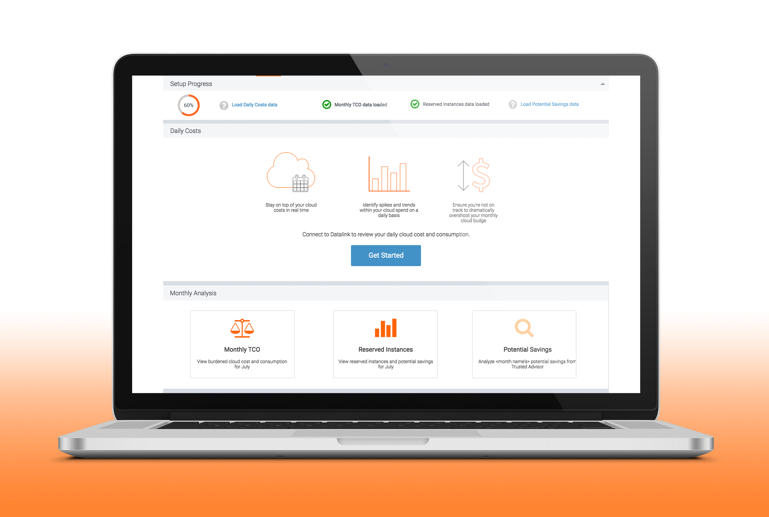
Setup Progress: A progress bar was added to the top of the page to help Ian keep track of his actions when setting up the tool, thus providing feedback and feedforward from within. It could collapsed from view, but not dismissed. This design was meant to nudge him to take action and fulfill the business requirement of optimizing tool usage. It also contained icons for tool tips that provided him with additional information when loading data into that specific part of the tool. The goal was to provide users with all the necessary information in the tool itself and prevent them from leaving it to seek help.
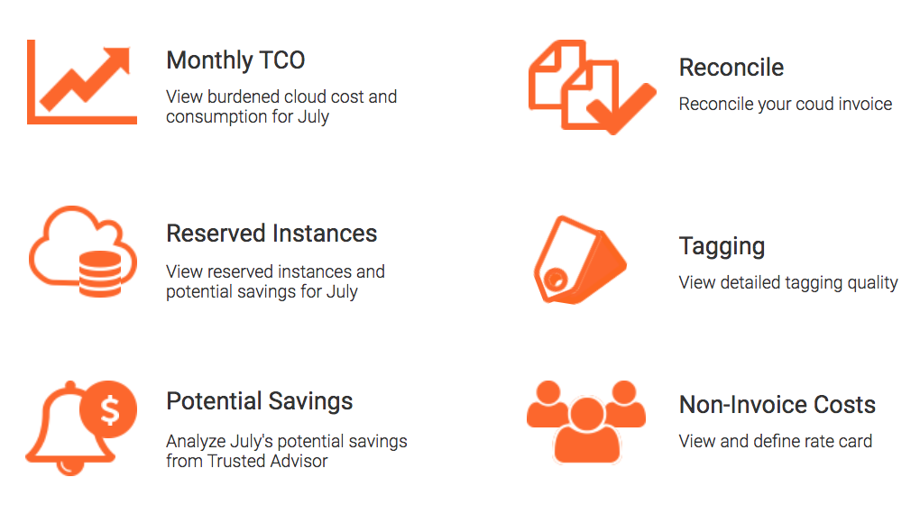
Adding Subsections: Within each section of the dashboard was a subsection that the user can interact with such as Monthly TCO, Tagging Quality etc. To provide the user with some idea of what it entails I put there a short blurb about its usage based on the value proposition provided by the Product Manager.
Accessibility: The initial design had an action button "view" for each of the individual subsections. However this design was replaced by a tile design considering accessibility and how annoying it can get for the user to hear the word "view" repeatedly. Now instead of seeing multiple "view" buttons, the entire tile was clickable.
Daily Cost: This section was put front and center with a single primary call to action, "Get Started". It's value proposition was made apparent and hard to miss. Even if Ian decided to skip linking his company's actionable data to the Daily Cost section of Public Cloud and proceed with Monthly Maintenance instead, the Daily Cost card would always be at the top of the dashboard with the clear call to action.
Iconography: Icons were designed for the tool in to take the burden off of just text to navigate through the page. This was an iterative process and the final icons shown below have been shipped.

Different Stages of Onboarding


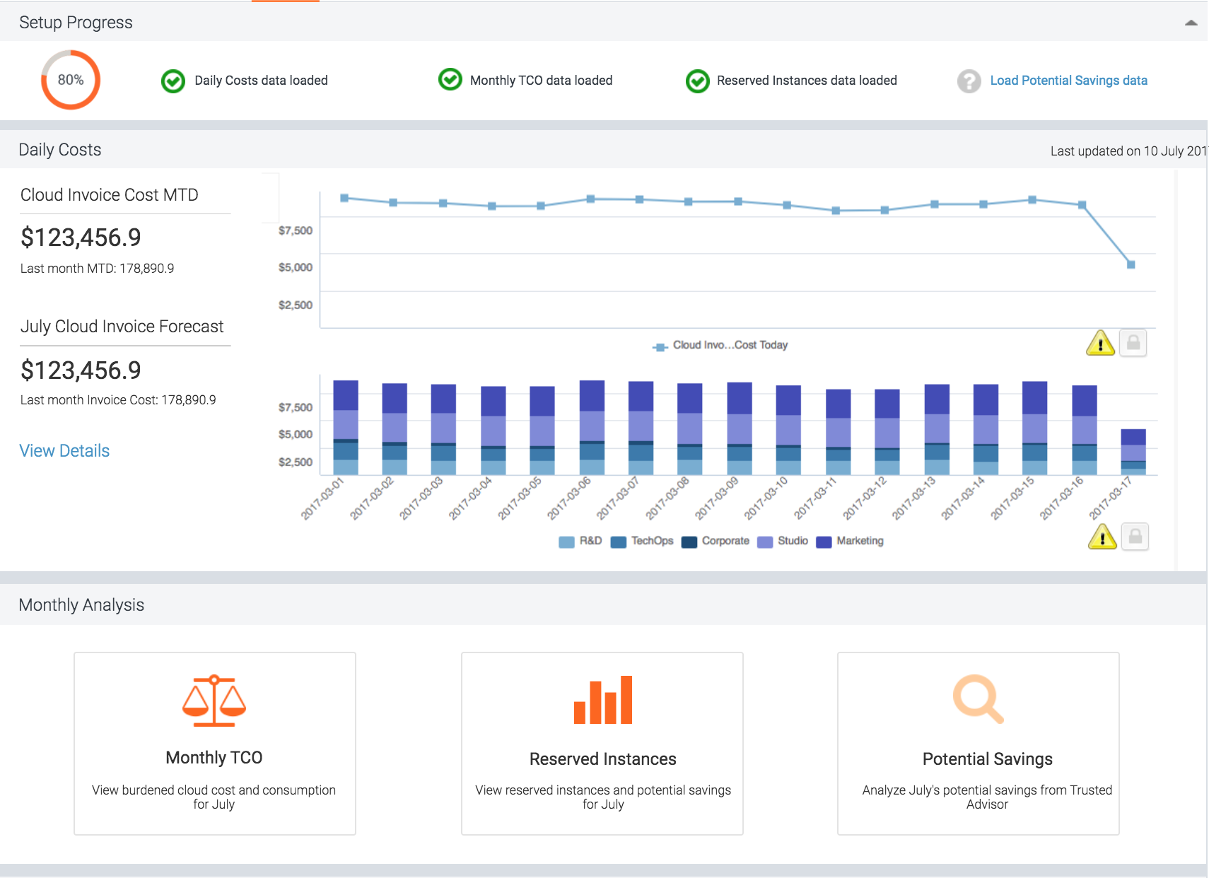


Final dashboard design:
After several iterations of design and going back and forth with the PM and developers, the final version of the dashboard shown below was created and shipped to clients. The redesigned tool managed to impress Public Cloud's Product Manager and the interface design has received a positive feedback from its users.

Key Takeaways
This project has taught me the valuable lesson of being an efficient team player who is capable of collaborating with different members of the Product Development team.
It has helped me hone my communication skills so that I can express not only my thoughts, concerns and decisions but also clearly articulate questions and what it is that I have not understood.
Most importantly, it has taught me how to work with management level and what to take away from a meeting with them. I understood what questions to ask them, the significance of knowing the business goals driving the development, working on a strict timeline with a stakeholder who has limited time for me and how to design for a user I've never met.